Defenders of Legacy: The Story Behind The Doescher Group Logo
Sometimes things become iconic. While much of entrepreneurship is strategic and practical, sometimes you have a hunch or a gut feeling that ends up becoming part of your business’s story.
Have you ever made a decision without knowing quite why and then, over time, that decision feels almost mythic in its significance? As the years pass, your original intention and your current version of the story start to meld together into something you cannot tease apart. Perhaps it’s a childhood anecdote, an athletic achievement, or a great challenge you overcame … The old “we walked to school five miles, uphill both ways” type of story.
That’s the way it is with the Doescher Group logo. I feel like I tapped into something more meaningful than I understood at the time.
It Started In A Cold Basement With One Good Investment

Let me take you back. When I first started Doescher Group, I had no real intention of creating a business per se. I was focused on building an income for myself and my family. I had a hunch that I might be able to do that by serving business owners.
My office was in the basement of our small two-story home, and I wore fingerless gloves and a fleece blanket to stay warm down there in the winter. I had no team, no real overhead … just my lifestyle to pay for.
So I decided if I was going to invest in anything, it would be a logo. I ended up hiring graphic artist Brent Holloman, who had worked with my wife in the past. Somewhere along the way, I must have mentioned Narnia, as we ended up going down the route of creating a character from that famous C.S. Lewis book series.
Our hero ended up being Mr. Tumnus, who is the very first Narnian that Lucy meets when she enters Narnia through the wardrobe in The Lion, the Witch, and the Wardrobe. They meet in a snowy forest by a magical lamppost, in a beloved scene, and Mr. Tumnus offers Lucy his umbrella.
When placed on a shield, the profile of Tumnus’ head looked perfect.
I’m not sure exactly what it meant to me at that precise moment, but I’m certainly glad I made the investment of time in thinking about the company logo and investing in Brent’s creativity. As it turns out, Doescher Group did become a company, and one I’m very proud to be part of. And I’m really glad that I invested the time up front in creating a great logo with meaning.
Here are the meanings we’ve continued to discover over time.
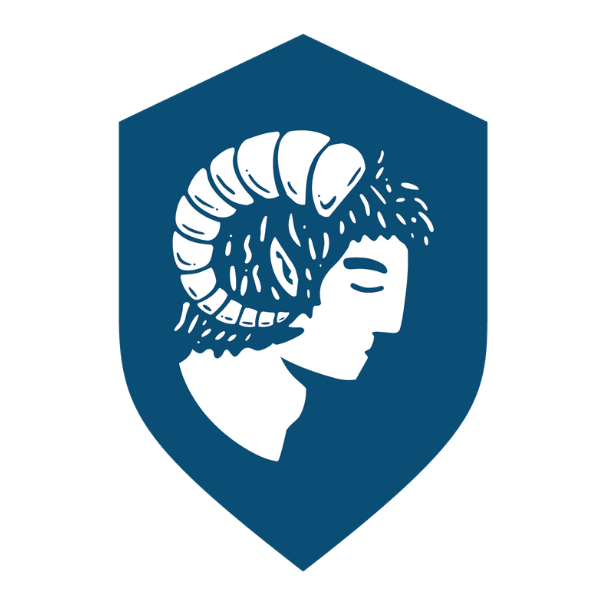
The Shield: Protecting Your Legacy Through Business Exit
At Doescher Group, we see ourselves as defenders of legacies. We take our job of leveling the playing field for self-made business owners seriously.
Our clients have a lot to protect, and what better symbol than a shield to represent this?
For clients navigating a business exit, the shield carries a second meaning: we defend them not just in legacy, but from the noise and pressure of the sale itself. We take on the brunt of the sales process, which empowers them to keep doing what they do best, which is to run the business and make sure it continues to perform all the way through closing and beyond.
Tumnus: The Guide, The Truth Teller, The One Who Never Quits
First and foremost, Mr. Tumnus is a guide. He is a fawn, a half-human, half-goat creature who meets Lucy and serves as the one who leads her into the strange land of Narnia.
At Doescher Group, we endeavor to provide trusted guidance to business owners seeking to navigate unfamiliar financial terrain. We aren’t the ultimate decision maker, but instead someone walking right alongside our decision makers' clients, helping them make better decisions.
Second, Tumnus is not perfect. (You might remember the plot twists!) But in the end, Tumnus finds his courage and stands up for what is right. We do not have all the answers, but one of our core values is “Always the Truth.” You can rely on us to provide you with the unvarnished truth as we see it, delivered with care.
Third, we never give up. Another one of our core values is “Obstacles are Opportunities.”Despite being turned to stone, Tumnus never gives up hope and ends up being one of the heroic figures of the final chapter of the book. We never stop looking for solutions to our clients’ problems. Ask our clients, they’ll tell you.
The Colors: Blue For Trust, Yellow For Approachability
Of course, the color palette is blue and yellow … As a lifelong University of Michigan sports fan and eventually an alumnus, I’m partial to these colors. The blue is my go-to and speaks of professionalism, but the yellow is playful and speaks to another of our core values: "Approachable Experts”. We have the tools and experience to do a great job for clients without pretentiousness or inside jargon. We speak plainly, and our colors do too.
Ready To Talk About Your Next Chapter?
Whether by strategic intent or happy accident, we have a Doescher Group logo that is meaningful to us and speaks to the work that we do every day. We hope this walk down memory lane has been an enjoyable read. If you are, in fact, a reader, do go and read anything by C.S. Lewis, especially the Chronicles of Narnia.
Every good story needs a guide. If you're standing at the entrance to some unfamiliar terrain — wondering what a transition, a sale, or an exit might really mean for your legacy, that's exactly where we do our best work. Let’s Talk.